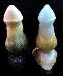
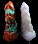
New Monty vs. Retro Monty
The tarnished copper Monty on the left is the updated model, and the lavender/white one on the right is the original model. This particular one has a bit of a lean, but I find it endearing.
Monty now has a smoother overall curve, more skin fold detailing around the base, and major changes to the topside plate design. The head is slightly less pointed and overall it has a heftier appearance than before.
Tag: phoenixflame creations
Retro Skoll vs New Skoll
Retro Skoll – technically Skoll 2.0 – is on the left, and New Skoll – technically 3.0 0 – is on the right. Skoll 1.0 was retired early and is being replaced by something else.
New Skoll features a few tweaks that differentiate it from 2.0. The base has been completely retextured, and as you can see in the last image, the base is now a little wider overall. Some awkward geometry in the head has been fixed, as it printed a little differently than expected the first time, and the urethral opening is more pronounced.
His tattoos have also been retooled slightly, to make up for them getting a little washed out by my coating methods on the previous model. They’re a bit more streamlined now and alter how the toy looks from the topside… but I think it’s for the best!


